Goal
The main goal of this lab is to become familiar with primary analytical processes in remote sensing. We will learn how to use RGB to IHS transformations, image mosaic, spatial and spectral image enhancement, band ratio, and binary change detection. After performing each of these processes, we will be able to replicate the operations for different circumstances and use them in real life projects.
Methods
The first transformation we performed was changing a RGB(red, green, blue) image to an IHS(intensity, hue, saturation). The change is done using a Spectral tool called RGB to IHS. You have to make sure the Red, Green, and Blue bands are set to layers 3, 2, and 1 for this to work properly. The resulting image makes it easier to distinguish between common features that would otherwise be harder to tell apart using the original image. The transformation can be seen below in Figure 1.
Now that we have a IHS image, lets transform it back to a RGB image. To do that, use the IHS to RGB transformation, which is also a spectral tool. Then make sure that band 1 represents Intensity, band 2 hue, and band 3 saturation. Then run the model and you get a resulting image that looks very similar to the original RGB image.
Lastly, lets run a stretch I&S function on the IHS image to transform it back to a RGB image. To do that, follow the same steps as before except this time we have to check the Stretch I&S option. This extends the display of pixels to create more variations of pixel values. It is easily viewed by comparing the two image's histograms. The newly stretched histogram has pixel values that extend 30 units further to the left and right than the original image's histogram. This can even be seen in the image itself for there are both darker and lighter colors displayed that make it easier to distinguish between features that were very similar before the transformation. This process can be seen below in Figure 2.
If you have a study area that is larger than the spatial extent of one satellite image, or is located on the intersection between two images, you will have to perform an mosaic to combine the two satellite scenes to that encase the entire study area. The first type of mosaic we will use is the Mosaic Express. For this type of mosaic, all you have to do is bring both images into the same viewer and use the Raster tool Mosaic Express. After the model is run, you get a resulting image that has combined the two satellite scenes into one. This method is not very effective for it leaves a clear indication that the two images were not originally together and have completely different color values, saturation, and even hue. This mosaic is located below in figure 3.
The more effective mosaic model we can run is called the Mosaic Pro. This is also a Raster tool and is run similar to the mosaic express but has a few more options we can customize. The main option we want to activate is a Color Correction tool called Use Histogram Matching. This will match the two image's histograms which will help blend them together. We are also going to us the Overlay tool to incorporate the brightness values of the top image at the area of intersection. That will also help blend the two images together. After the model is run, the resulting image is shows a vastly improved scene in which the area of intersection is blended together with more accuracy than the Mosaic Express model. There are still some areas along the intersection where it is clearly visible that the two images were combined but it is a far more accurate mosaic than the Express. The Mosaic Pro images can be seen in Figure 4.
Another useful tool to help identify features in a satellite image is a Band Ratio method called normalized difference vegetation index, or NDVI. This is particularly useful to identify where green vegetation is located on a satellite image. NDVI is a Unsupervised Raster tool that uses the 'Landsat TM' sensor and NDVI function. Once you run the model, it transforms all green vegetation into a bright white color and everything else into a shade of gray. That makes it very easy to distinguish between vegetation and other features that are on the image. The result of the NDVI method can be seen in Figure 5 below.
Now lets look at some Spatial Image enhancement techniques that can be applied to remotely sense images. The first technique is going to be applying a low pass filter on a high frequency image. The reason we want to do this low pass filter is because a high frequency image has significant changes in brightness values over short distances which can make the image features hard to distinguish. The filter we want to apply to our image is a 5x5 Low Pass Convolution filter, which can be found under the Raster Spatial tools. As you can see in Figure 6 below, the newly filtered image has less variation in brightness which blends the features together.
In turn, you can take a low frequency image and apply a high pass filter on it to sharpen up the features by having more variations of brightness values over a shorter distance. To do this, follow the same steps when using a low pass filter but instead of selecting 5x5 Low Pass Convolution, choose 5x5 High Pass Convolution. The resulted image has more depth in brightness values over shorted distances which gives more variation to different features that are located closely together. The transformation displaying the before and after can be seen in Figure 7.
The last spatial technique we used in this lab is Edge enhancement, specifically, Laplacian Edge Detection. This is also a Convolution tool but instead of choosing a 5x5 filter, we are choosing a 3x3 Laplacian Edge Detection not with a Normalized Kernel. This method sharpens the image by locally increasing the contrast at discontinuities and gives it a more natural look. The result after the Laplacian convolution mask was applied can be seen in Figure 8 below.
Now lets move onto some Spectral enhancement techniques. The first type of enhancement we applied to the satellite image is called the Minimum-Maximum contrast stretch. This is used with images that have a Gaussian histogram. The stretch uses the histogram and extends the minimum brightness value(BV) to 0 and the maximum BV to 255. An example of what the histogram looks like before and after a min-max stretch is in Figure 9. This technique is a Panchromatic General Contrast tool and needs to have the method type changed to Gaussian. That will show an area of the image and how it compares to other method types. Figure 10 shows the min-max contrast stretch on the Gaussian image.
Another Spectral enhancement technique we used on our satellite image was a technique called piecewise stretch. It is a General Contrast tool that allows us to specify the ranges we want the linear stretch to be applied on the histogram. We choose to have the Low range to be from 6 to 30, the Middle range from 31 to 76, and the High range from 77 to 109.The images in Figure 11 show the before and after effects of the Piecewise stretch.
The last Spectral enhancement technique that was used on the satellite image was the Histogram Equalization. This nonlinear stretch redistributes pixel values in the image so the pixels in the output image are equally distributed among the range of output values. That results in a relatively flat histogram which in turn increases the contrast in the image. The original image, Figure 12 - left, has a low contrast with most of the color in the middle gray area with some white. Compared to the image on the right which has a higher contrast due to the histogram equalization that was applied to it. The technique is a Radiometric Raster tool that automatically redistributes the pixel values, resulting in a higher contrast image.
The last part of the lab involved Binary change detection or image differencing. In order to do this, you need two images to create the new output image. The Two Image Functions tool allows us to then use the Two Input Operators in which we input the two image files and name the output file that will be created. To simplify this process we only used one layer from both images, in this case we used layer 4. The resulting photo is located in Figure 13 below.
Now that we have the image that was created from subtracting the two primary satellite images, we can estimate the threshold of change-no-change. To figure out which areas actually changed, we can look at the histogram tails. To decide where the tails actually start we had to do a little math. The cut off point of the tails were decided with the equation mean + 1.5*standard deviation. The numbers we used for the tails can be seen in Figure 14.
Now we can map out the changes that occurred within the image which was between August 1991 and August 2011. For this equation, we needed to use the Model Maker in Erdas Imagine 2013. By using the Function object between the two images, we ran the equation ($n1_ec_envs_2011_b4 - $n2_ec_envs_1991_b4 + 127) and this gave us our output file. The last calculating step comes next to determine the upper tail of the new histogram which contains the changed areas. For this we used mean + (3*standard deviation). Then, by using another Model Maker and the value we just calculated, we can finally get the pixels that changed between the two images. The Model Maker Functional Definition equation we used was: EITHER 1 IF ( $n1_ec_91> change/no change threshold value) OR 0 OTHERWISE. This means show all pixels with value above 'change/no change threshold value' and mask out those that are below the 'change/no change threshold value'. With the output file created, I opened it up into ArcMap and put an overlay image on it and changed the feature colors to get the resulting image in Figure 15.
Results
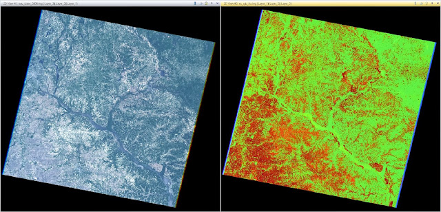 |
Figure 1 - RGB to IHS Transformation
|
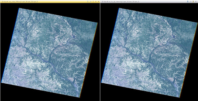 |
Figure 2 - RGB to RGB Stretched Transformation
|
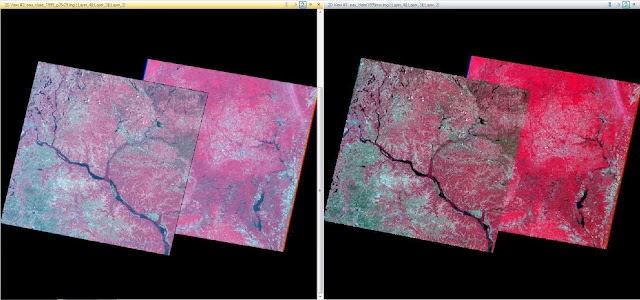 |
Figure 3 - Mosaic Express
|
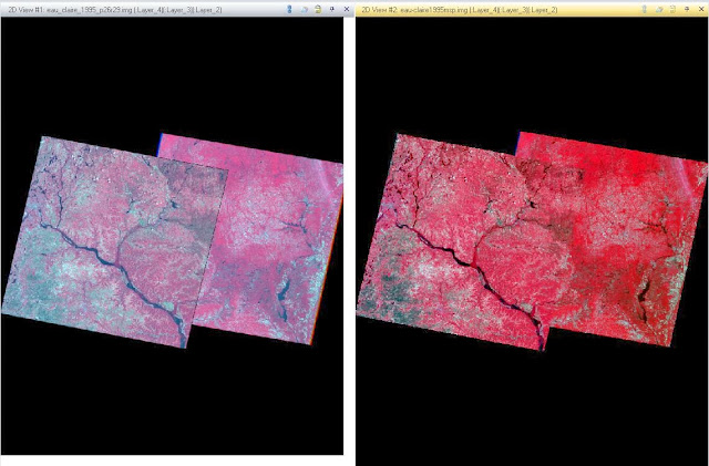 |
Figure 4 - Mosaic Pro
|
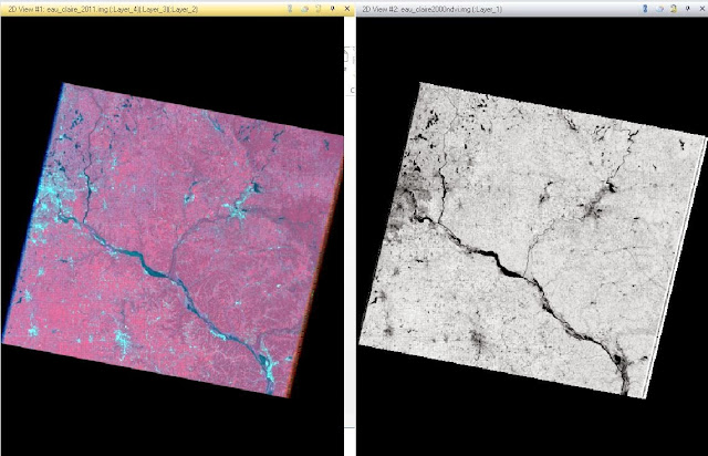 |
Figure 5 - Normalized Difference Vegetation Index (NDVI)
|
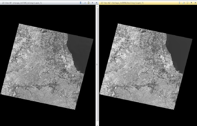 |
Figure 6 - 5x5 Low Pass Convolution
|
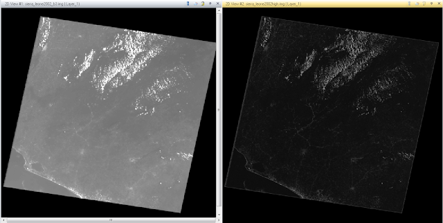 |
Figure 7 - 5x5 High Pass Convolution
|
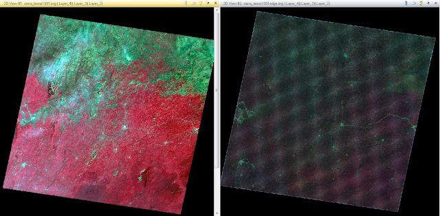 |
Figure 8 - Laplacian Edge Detection
|
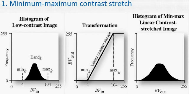 |
FIgure 9 - Minimum - Maximum Contrast Stretch
|
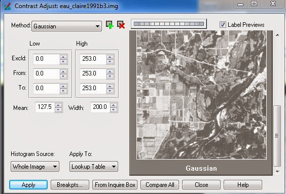 |
Figure 10 - Minimum - Max Contrast Stretch - Gaussian
|
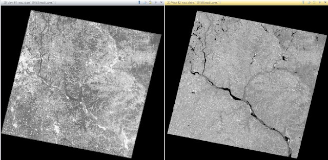 |
Figure 11 - Piecewise Contrast
|
 |
Figure 12 - Histogram Equalization
|
 |
Figure 13 - Difference Image
|
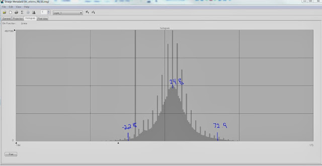 |
Figure 14 - Histogram User-specified change/no change threshold
|
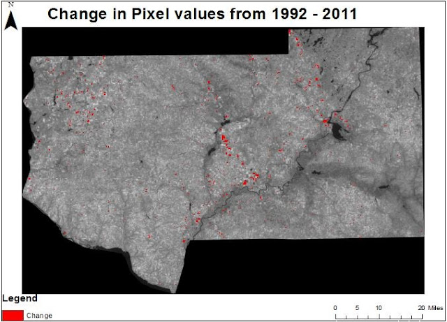 |
Figure 15 - Change in Pixel values in Eau Claire County and four other neighboring counties between August 1991 and August 2011.
| |
|


